
Here’s the whole thing, start to finish. It takes longer to read than to do.
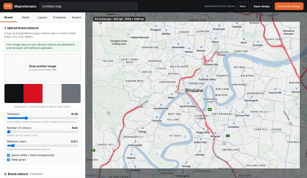
Upload your brand artwork, or paste hex codes
Open the map studio and go to Brand. Drop in a logo, a brand guidelines page, a mood image or a swatch sheet (PNG, JPG, SVG or WebP). Already know your colours? Paste the hex codes instead, or add them one at a time with the colour picker.
Your image never leaves your device. Colours are detected in your browser and nothing is uploaded.
Dial in the colours
- Tolerance controls how similar two colours must be to count as one. Lower keeps subtle tints apart; higher merges them.
- Number of colours: Auto, or exactly as many as you want.
- Minimum share: lower it to catch small accent colours, like that tiny orange dot in the logo.
- Eyedropper: click the image preview to add an exact colour. It’s locked, so it survives the next upload.
- Lock any colour you want to keep while you try other images.
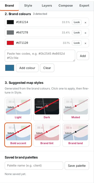
Pick a suggested style
Maprehension builds six styles from your palette: Light, Dark, Muted, Bold accent, Brand tint and Brand land. Each one keeps labels readable against the background. Click one to apply it.
Fine-tune colours and layers
In Style, change any map colour (land, water, parks, roads, motorways, labels and more), with your brand colours one click away. Adjust saturation, contrast, opacity, road width and label size.
In Layers, show or hide place names, road names, POIs, water names, parks, rail and boundaries. Set buildings to hidden, 2D footprints or 3D, with their own colour and height.
Find the site, add pins and rings
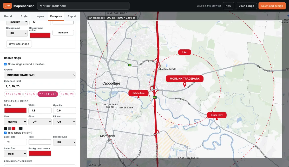
In Compose, search the address (or click the map) and add it as the subject site. Style the pin, the label and its background. Draw the site outline if you want the boundary shown.
Add nearby places with their own labels, and turn on radius rings: pick the distances (1, 2, 5, 10 km or your own) and style the lines, glow, fill and ring labels.
Choose the frame
Pick A4 or A3 (portrait or landscape) at 150, 200 or 300 dpi, or a screen size: 16:9, square, Instagram or a social link card. The frame on the map shows exactly what will export.
Export PNG or JPG
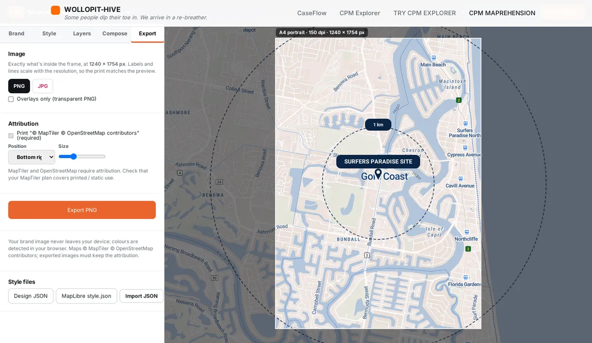
In Export, choose PNG or JPG and hit export. Labels and lines scale with the resolution, so the print looks like the preview, not a postage stamp. You can also export just the overlays on a transparent PNG to drop over your own artwork.
Save your design
Your work autosaves in this browser. To keep it, share it or move it to another computer, use Download design (a small .json file). Bring it back any time with Open design.
Tips for print
- Use 300 dpi for anything printed. 150 dpi is fine for screens and drafts.
- Exports are RGB. If your printer needs CMYK, convert the image in Photoshop or InDesign and check the colours before sending it.
- Keep important labels away from the very edge of the frame: printers trim.
- Bold, high-contrast styles survive cheap printing better than subtle ones.
Attribution: please keep it
The map data comes from OpenStreetMap contributors and the map tiles from MapTiler. Their licences require attribution, so every export includes a small “© MapTiler © OpenStreetMap contributors” credit. Please leave it on anything you publish.